

Eco-Friendly Packaging Solutions for Cosmetic Brands in 2026
Leave a CommentSustainability continues to influence how cosmetic brands approach product packaging. From skincare and makeup to fragrances, haircare, and personal care products, brands are looking for ways to reduce unnecessary materials while maintaining the premium appearance, durability, and functionality customers expect.
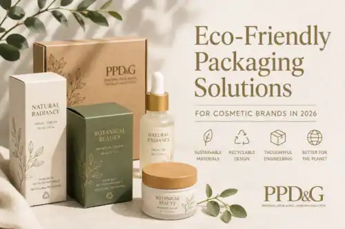
In 2026, eco-friendly cosmetic packaging is about more than simply choosing a recyclable material. Brands should consider the entire packaging system, including material selection, package size, structural design, printing, coatings, inserts, shipping efficiency, and what happens to the packaging after it reaches the customer.
For cosmetic brands developing new packaging or updating an existing program, the following strategies can help create more sustainable packaging without sacrificing presentation.
1. Reduce Packaging Material Where Possible
One of the most straightforward ways to improve packaging sustainability is to use less material.
Cosmetic products often rely on secondary packaging to protect delicate containers, create shelf presence, or provide a premium unboxing experience. However, oversized boxes, unnecessary layers, and excessive inserts can increase material consumption and shipping volume.
Brands can work with their packaging manufacturer to right-size boxes around the product and eliminate components that do not contribute to protection, presentation, or functionality.
Thoughtful structural design can help reduce material use while still providing the polished appearance expected from cosmetic packaging.
2. Choose Recyclable Packaging Materials
Paperboard and corrugated materials are important options for cosmetic brands looking to improve package recyclability. Depending on the packaging requirements, brands may be able to use recyclable paper-based structures for folding cartons, rigid boxes, displays, gift sets, and shipping packaging.
Material selection should account for more than appearance. Packaging designers must also consider the product’s weight, fragility, distribution environment, and required level of protection.
Whenever possible, simplifying the number and types of materials used within a package can also make it easier for consumers to understand how to dispose of individual packaging components properly.
3. Incorporate Recycled Content
Using packaging materials containing recycled content can help reduce reliance on virgin materials.
Depending on structural and aesthetic requirements, cosmetic brands may be able to incorporate recycled paperboard, chipboard, corrugated material, or other recycled-content substrates into their packaging.
The appropriate percentage and type of recycled content will depend on the application. Premium cosmetic packaging, for example, may require specific surface characteristics to achieve precise printing, embossing, foil stamping, or other decorative effects.
Working with an experienced packaging manufacturer can help brands balance sustainability goals with structural and visual requirements.
4. Reconsider Plastic Inserts
Plastic inserts have traditionally been used to hold cosmetic products securely inside boxes, kits, and displays. In some applications, however, paperboard or molded fiber alternatives may provide the necessary product protection while reducing the amount of plastic within the package.
Cosmetic brands should evaluate inserts based on the specific product rather than automatically selecting one material.
Glass bottles, jars, pumps, applicators, and other components may require different levels of cushioning and support. A properly engineered insert can protect the product while minimizing unnecessary material.
5. Design Packaging for Reuse
Not every sustainable packaging strategy has to focus exclusively on disposal.
Premium cosmetic packaging can also be designed with reuse in mind. Well-constructed rigid boxes, presentation boxes, and gift boxes may continue to serve a purpose after the original product has been removed.
A reusable package can be designed for storing cosmetics, accessories, samples, or other personal items. This approach is particularly relevant for luxury skincare, fragrance collections, influencer kits, limited-edition products, and cosmetic gift sets where the packaging itself is part of the product experience.
6. Simplify Printing, Coatings, and Decorative Finishes
Specialty printing and finishing can transform a simple package into distinctive branded packaging, but brands should evaluate which decorative elements are truly necessary.
In 2026, effective cosmetic packaging does not necessarily mean adding more finishes. Strategic use of typography, structural design, color, embossing, debossing, and carefully selected decorative elements can create a premium appearance without overwhelming the package.
Brands pursuing specific recyclability or sustainability goals should discuss inks, laminations, coatings, adhesives, foils, and other finishing options with their packaging supplier early in the design process. Some decorative treatments may affect how a finished package can be recycled.
7. Consider Shipping Efficiency During Package Design
Sustainable cosmetic packaging extends beyond the retail box itself.
Package dimensions can affect how many products fit into a shipping case, onto a pallet, and into a delivery vehicle. Even relatively small reductions in package dimensions can improve packing efficiency when products are manufactured and distributed at scale.
Right-sizing packaging can potentially reduce corrugated shipping material, void fill, storage requirements, and transportation volume.
For brands selling directly to consumers, packaging should also be designed with e-commerce fulfillment in mind. A package that looks attractive on a retail shelf may require additional protection when shipped individually through a parcel delivery network.
8. Avoid Sustainability Claims That Are Difficult to Support
As consumers and regulators pay closer attention to environmental marketing, cosmetic brands should be precise about the sustainability claims appearing on their packaging.
Broad terms such as “green,” “environmentally friendly,” or “100% sustainable” can be difficult to substantiate when the underlying environmental benefit is unclear.
Instead, brands should focus on specific, supportable attributes when appropriate, such as the percentage of recycled content, reduced material usage, recyclability, or removal of a particular packaging component.
Packaging sustainability should be measurable whenever possible rather than based solely on marketing language.
What Should Cosmetic Brands Look for in Sustainable Packaging?
There is no single packaging material or structure that will be the most sustainable choice for every cosmetic product.
A lightweight folding carton may be appropriate for one product, while another may require a rigid box and engineered insert to prevent a glass container from breaking. Choosing packaging that fails to adequately protect the product can ultimately create additional waste through damaged goods, returns, and replacements.
When developing eco-friendly cosmetic packaging, brands should consider:
- The amount of material required
- Recycled-content opportunities
- Recyclability of individual components
- Number of different materials used
- Product protection requirements
- Package dimensions and shipping efficiency
- Printing, coating, adhesive, and finishing requirements
- Opportunities to eliminate unnecessary plastic
- Potential for package reuse
- Clear end-of-life instructions for consumers
The right solution balances sustainability with performance, manufacturability, branding, cost, and the realities of the product’s distribution environment.
Sustainable Cosmetic Packaging Starts With Good Design
Choosing eco-friendly materials is an important part of creating more sustainable cosmetic packaging, but materials are only one piece of the process. Your packaging also needs to account for the product, dimensions, structural requirements, branding, printing and finishing processes, shipping conditions, and overall customer experience.
At PPD&G, we provide custom packaging solutions designed around your specific cosmetic products, brand requirements, and sustainability goals. From custom boxes and retail packaging to rigid setup boxes, displays, and specialty packaging solutions, our team can help turn your packaging concept into a finished product.
Planning a new cosmetic packaging project for 2026? Contact PPD&G to discuss your custom packaging needs.
Popular Fonts for Packaging in 2026
Leave a CommentChoosing the right font is one of the most important decisions when designing custom packaging. The typeface you use can make a product feel modern, luxurious, playful, traditional, natural, or industrial before a customer ever reads the words on the package.
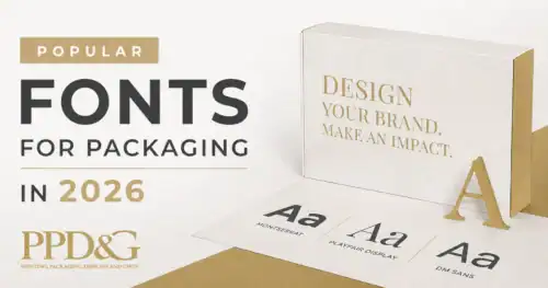
In 2026, packaging typography continues to move beyond simple minimalism. Clean sans-serif fonts remain popular, but classic serif typefaces, rounded letterforms, bold display fonts, and more expressive typography are also becoming increasingly common. The best font for your packaging ultimately depends on your brand, your product, and how the text needs to function on the finished package.
Below are some of the most popular fonts and font styles to consider for packaging design in 2026, along with examples of how they can work for different types of products.
What Makes a Good Packaging Font?
A font that looks great on a computer screen does not automatically make a good packaging font. Packaging typography has to work in the real world, often at different sizes and across different materials and surfaces.
When choosing a font for packaging, consider these factors:
- Readability: Product names and important information should be easy to read at a glance.
- Brand personality: The font should reinforce the feeling you want customers to associate with your product.
- Print size: Very thin or highly decorative fonts can become difficult to read when printed at small sizes.
- Packaging material: A font that works well on a smooth folding carton may not have the same appearance on a textured paper, flexible pouch, or other material.
- Font pairing: Using two complementary fonts can create visual hierarchy without making the package look cluttered.
- Versatility: A good packaging typeface should work across your product line, including different products, flavors, colors, or sizes.
These considerations become especially important when designing packaging for different industries. For example, typography for custom cosmetic packaging may need to communicate luxury and sophistication, while typography for custom apparel packaging may be more focused on fashion, personality, and brand recognition.
1. Montserrat
MONTSERRAT
FRESH. SIMPLE. MODERN.
Best for: Food packaging, cosmetics, wellness products, beverages, retail products, and modern brands.
Montserrat is a versatile geometric sans-serif that works especially well when a brand wants its packaging to feel clean, contemporary, and approachable. Its strong letterforms make it effective for product names and headlines, while its range of weights provides flexibility for supporting copy.
Montserrat is also useful when a company needs a consistent typography system across packaging, websites, advertising, and other marketing materials. Pair it with a lighter weight of Montserrat for a simple, unified design, or combine it with a serif such as Cormorant Garamond for more contrast.
2. Cormorant Garamond
Cormorant Garamond
CRAFTED WITH CARE
Best for: Luxury packaging, beauty products, skincare, candles, specialty foods, wine, and premium products.
Serif fonts have been gaining renewed attention in packaging design, and Cormorant Garamond is a strong example of the style. Its elegant letterforms can give packaging a sophisticated, editorial, or handcrafted appearance.
This typeface works particularly well when the goal is to make a product feel premium without relying on excessive graphics. Cormorant Garamond can also be paired with a clean sans-serif font for supporting information.
This style of typography can be especially effective for premium products such as custom perfume packaging, where typography plays an important role in communicating the identity and positioning of the brand.
3. Playfair Display
PLAYFAIR
PURE. REFINED. TIMELESS.
Best for: Beauty products, perfume packaging, specialty foods, fashion products, and luxury brands.
Playfair Display is another serif option that can bring an upscale appearance to packaging. Its high contrast between thick and thin strokes gives it a distinctive look that can work particularly well for product names, brand names, and other large display text.
Because of its decorative character, Playfair Display is usually more effective as a headline or display font than as the primary typeface for large amounts of small packaging copy.
Luxury typography can be particularly effective on custom liquor packaging and wine boxes, where the package often needs to communicate quality and craftsmanship before the customer even sees the product.
4. DM Sans
DM SANS
EVERYDAY PRODUCTS. BETTER DESIGN.
Best for: Consumer products, health and wellness, food, technology, supplements, and minimalist packaging.
DM Sans has the clean appearance many brands want from a modern sans-serif while maintaining a friendly, approachable feel. Its straightforward letterforms make it a practical choice when readability is a priority.
It can work as both a headline and supporting font, making it useful for packaging systems that need to accommodate product names, descriptions, ingredients, directions, and other information.
5. Oswald
OSWALD
BIG FLAVOR. BOLD IDEAS.
Best for: Food and beverage packaging, sports products, promotional products, industrial products, and bold retail designs.
Oswald is a condensed sans-serif that can make a product name stand out without requiring a large amount of horizontal space. This makes it particularly useful when a package has limited room for large display typography.
Its bold appearance can create a strong, energetic personality. Oswald can also be paired with a more neutral sans-serif for smaller supporting information.
Bold typography can also work well for apparel packaging, particularly when the packaging is designed to reinforce a fashion or lifestyle brand.
6. Bebas Neue
BEBAS NEUE
MAKE YOUR PRODUCT STAND OUT
Best for: Beverage packaging, food products, sports products, apparel packaging, and attention-grabbing retail designs.
Bebas Neue is a bold display font designed to attract attention. Its condensed structure allows designers to create large, impactful headlines while using relatively little space.
It is best used selectively. Using a bold display font for every piece of information can make packaging difficult to scan. Instead, use it for the brand name, product name, or another important message and pair it with a simpler font for supporting text.
Strong display typography can be especially useful for PR packaging for influencers, where the packaging itself can be part of the marketing experience and needs to make an immediate visual impression.
7. Lora
Lora
Naturally Made. Thoughtfully Designed.
Best for: Natural products, specialty foods, coffee, wellness products, handmade products, and brands emphasizing craftsmanship.
Lora combines the traditional character of a serif with a relatively contemporary appearance. It can help packaging feel warm and established without looking overly formal.
This makes it a useful option for brands that want to communicate craftsmanship, authenticity, or a connection to traditional production methods.
8. Libre Baskerville
LIBRE BASKERVILLE
A CLASSIC LOOK FOR MODERN PRODUCTS
Best for: Food packaging, specialty products, premium goods, publishing-inspired brands, and products with a traditional or established identity.
Libre Baskerville is a classic serif that provides a more traditional alternative to geometric sans-serif typography. Serif fonts like this can be especially effective when a package needs to communicate heritage, quality, craftsmanship, or trust.
For a contemporary look, consider pairing Libre Baskerville with a clean sans-serif for product details and secondary information.
This traditional approach can be a strong fit for industries where presentation and perceived quality are especially important, including liquor and wine packaging.
9. Helvetica
HELVETICA
CLEAN. CLEAR. CONFIDENT.
Best for: Minimalist packaging, technology, consumer products, cosmetics, industrial products, and brands focused on clarity.
Helvetica is one of the most recognizable sans-serif typefaces in graphic design and has been used across branding, print, advertising, and packaging for decades. Its neutral appearance makes it adaptable to a wide range of products.
One of Helvetica’s biggest advantages for packaging is its straightforward readability. It can be used for headlines, product names, labels, and supporting information, although designers may choose a more distinctive font when they want the package to have a highly unique personality.
A clean, neutral typeface can also provide a useful foundation for packaging in regulated or highly specialized industries. For example, custom cannabis packaging may need to balance strong branding with important product and compliance information.
10. Garamond
Garamond
TIMELESS QUALITY
Best for: Luxury packaging, specialty foods, beverages, books, heritage brands, and premium products.
Garamond is a classic serif family with a long history in typography and print. Its refined appearance can give packaging an established, traditional, or premium feel.
Garamond can be particularly effective when a brand wants to communicate history or craftsmanship. It also provides an interesting contrast when paired with a modern sans-serif.
How to Choose the Right Font for Your Packaging
There is no single best font for every packaging project. The right choice depends on what you are selling and the impression you want your package to make.
As a starting point, consider these combinations:
- Modern and minimalist: Montserrat + DM Sans
- Luxury and elegant: Playfair Display + Montserrat
- Natural and handcrafted: Lora + DM Sans
- Traditional and premium: Garamond + Helvetica
- Bold and energetic: Bebas Neue + DM Sans
- Classic and sophisticated: Cormorant Garamond + Montserrat
Using two fonts is often enough to create a clear visual hierarchy. One font can handle the brand or product name while the second handles supporting information. If you use three fonts, each should have a specific purpose. Adding too many typefaces can make packaging feel cluttered and make important information harder to find.
Think About More Than the Font
Typography is only one part of effective packaging design. The font needs to work with the package structure, colors, imagery, materials, finishes, and available space.
For example, a very thin typeface may look elegant on a computer monitor but lose some of its detail when printed at a small size. Similarly, a condensed display font may work perfectly for a large product name but be difficult to read when used for ingredients or instructions.
Before finalizing a packaging design, review the typography at its actual printed size and consider how it will look from a normal viewing distance. The goal is not simply to choose a beautiful font. The goal is to create packaging that communicates the brand quickly and clearly.
The physical structure of the package matters, too. Depending on your product and budget, typography may need to be incorporated into foldable boxes, collapsible boxes, or rigid setup boxes. Each format creates different opportunities for typography, printing, finishing, and overall presentation.
Popular Packaging Font Trends to Watch in 2026
Several broader typography trends are influencing packaging design this year. Clean and minimal sans-serif typography remains popular, but designers are also experimenting with softer letterforms, expressive typography, classic serif fonts, and bold display type.
One particularly important shift is the use of typography as a more prominent design element rather than simply a way to display information. A strong typeface can become part of the visual identity of a package, helping a product stand out on a crowded shelf or in an online product image.
Another important consideration is flexibility. Packaging designs often need to work across multiple products and formats. Choosing a typeface family with several weights and styles can make it easier to maintain consistent branding across boxes, bags, labels, inserts, and other packaging materials.
Custom Packaging Starts With Good Design
The right font can make a significant difference in how customers perceive your packaging, but typography is just the beginning. Your packaging also needs to be designed around the product, brand, materials, dimensions, printing process, and customer experience.
At PPD&G, we provide custom packaging solutions designed around your specific product and brand. From custom boxes and retail packaging to specialty packaging solutions, our team can help turn your packaging concept into a finished product.
Have a packaging project in mind? Contact PPD&G to discuss your custom packaging needs.
Frequently Asked Questions About Packaging Fonts
What is the best font for packaging?
There is no single best font for every package. Montserrat, DM Sans, Helvetica, Garamond, Cormorant Garamond, and other versatile typefaces can work well depending on the product and desired brand personality. The most important factors are readability, brand fit, print size, and how the font works with the overall packaging design.
How many fonts should you use on packaging?
For most packaging designs, two fonts are enough to create a clear hierarchy. A third font can be used as an accent when necessary, but using too many fonts can make packaging look cluttered and make important information harder to read.
Are serif fonts good for packaging?
Yes. Serif fonts can work especially well for premium, luxury, traditional, handcrafted, and specialty products. Garamond, Cormorant Garamond, Playfair Display, Lora, and Libre Baskerville are examples of serif fonts that can create different packaging styles.
Are sans-serif fonts good for packaging?
Yes. Sans-serif fonts are popular for packaging because they can provide a clean, modern appearance and remain highly readable across many applications. They are particularly common in minimalist, beauty, wellness, technology, food, and consumer product packaging.
Should packaging fonts be easy to read?
Absolutely. Packaging typography needs to communicate information quickly. Product names, descriptions, ingredients, instructions, sizes, and other required information should remain legible at the final printed size. Decorative fonts can be effective for headlines, but simpler typefaces are usually better for smaller supporting text.